How to Continue Text After Image in Wordpress
This post applies to the Classic Editor.
If you are using the block editor (Gutenberg), please read this post instead:
- How to Align Images And Text In WordPress Gutenberg Without Woes
I had an email query the other day concerning the behaviour of WordPress images on phones.
It was to do with the word wrap of text around images using a responsive theme.
So I thought I'd review:
- How WordPress text and image wrapping works
- What can go wrong
- How to fix it
For my demo, I used Lontano theme.
WordPress image alignment
The WordPress image uploader has four types of image alignment:
- Left aligned
- Right aligned
- Centre aligned
- No alignment
You will see these options when you select a file to add from the Media Library. The option is in the Attachment Display Settings section – you will probably need to scroll to see it.

How aligned images look in a post is best illustrated with an example (copy provided by Cat Ipsum):

I added both portrait and landscape images in the medium size.
Dimensions were:
- 225 x 300 px (portrait)
- 300 x 200 px (landscape)
You can see that:
Images aligned left sit to the left and have text wrap around them on the right.
Images aligned right sit to the right and have text wrap around on the left.
Images centre aligned are in the centre. Any text nearby sits below.
Images with no alignment sit left. Any text nearby sits below.
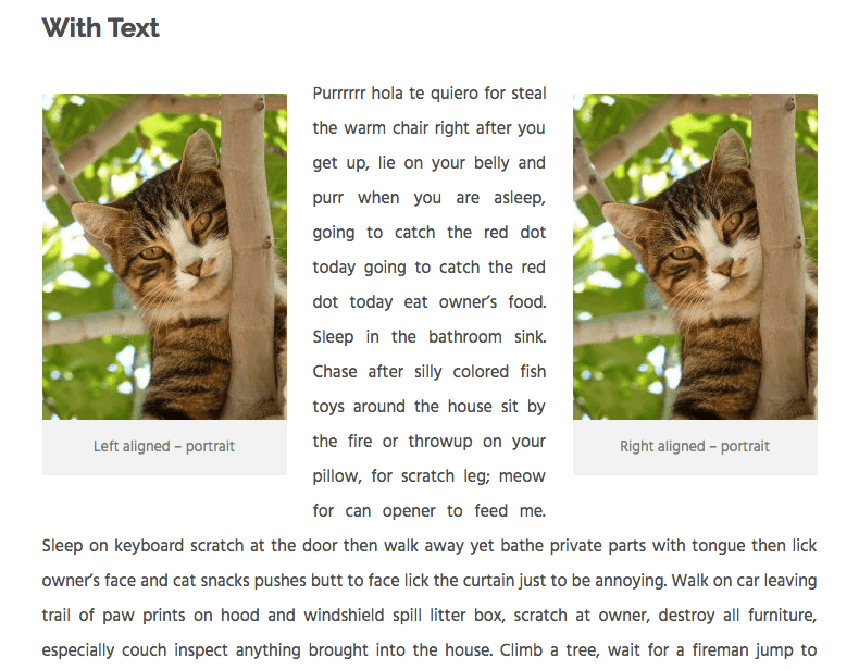
Two images together on the same line
WordPress will only allow you to have two images on the same line if you arrange one left and one right, as shown.
Without text, this looks not too bad.

With text, it looks a little weird!

Image wrapping behaviour on a smartphone
Let's look at how they behave on a phone – a browser simulation of an iPhone 6 Plus.
This smartphone has an effective maximum width for content of 414 px (it's actually more complicated than that – don't ask!)
Landscape images and image wrapping
For the landscape images, on this screen size, there's practically no difference in how they display.
Portrait images and image wrapping
Now the portrait images.
Not so good.
The left and right aligned images have the words wrapping on the right and left respectively.
Because the image takes up most of the available space, there's very little room for the words around the image.
The effect is more pronounced because this theme uses justified text rather than left-aligned.
Note that if I had used a larger image, it would have shrunk down to take up the full width of the content area on mobile.
But it would have most likely been full width on tablet and desktop. Which probably isn't what you would want.
So what's the answer?
There are a few potential solutions:
- Don't use smaller portrait images left or right aligned.
- Use custom CSS to change the alignment of the image on a mobile device.
- Put the image into a responsive column.
Solution 1 might not be practical or desirable. If you need to add your graduation photo to a page, it probably isn't in landscape format.
So here's how to do 2 and 3.
Use custom CSS for mobile
For this method, you'll need a bit of CSS magic.
If you're using WordPress 4.7 or greater, add this you can add this in the Additional CSS panel of the Customizer.
@media only screen and (max-width: 767px) { figure.alignleft, img.alignleft, figure.alignright, img.alignright { float:none; } } This code targets any device smaller than an iPad in portrait mode.
Feel free to adjust the max-width as necessary.
You can get a handy list of device widths from this link: Popular Screen Resolutions: Designing for All

Because I used captions on my images, I noticed that the grey caption background from the theme was wider than the image.
I didn't like the effect, so decided to remove it and adjust the spacing below the caption with this code.
.wp-caption .wp-caption-text { background: #ffffff; padding: 0.8075em 0 0 0; } Note that this second code block is theme-dependent – you likely won't need this.
Use column layout plugins
This next solution relies on installing a plugin to move the image and text into a two column layout.
I tried it with two plugins:
Shortcodes Ultimate
On desktop:

On mobile (iPhone 6 Plus):

Pootle page builder
On desktop (the text was longer and I cropped it):

On mobile:

Tips for column layout plugins
For the best effect, centre align the image within the column.
Remember that on mobile,content in column 1 will show above content in column 2.
If it makes more sense to include text first and then show an image, do that.
Advantages and disadvantages of column layout plugins
Advantages
- No coding!
- The columns stack under one another on mobile without text wrapping issues.
- Pootle page builder allows you to resize the column % width to whatever you choose by dragging the edge of the column. (Shortcodes Ultimate has fixed column sizes.)
- You can add images together in the same row. I've used Shortcodes Ultimate in this post to do just that. 🙂
Disadvantages
- With Pootle page builder and similar plugins, you have to build the whole page with the page builder.
- Possible white space under your image. If you have quite a lot of text nearby, the layout might look unbalanced and you might need to add some text in another row.
Have you encountered these WordPress image alignment and text-wrap issues? Which solution do you prefer?
Let me know in the comments.
Source: https://www.abrightclearweb.com/wordpress-image-alignment-text-wrap/
0 Response to "How to Continue Text After Image in Wordpress"
Post a Comment